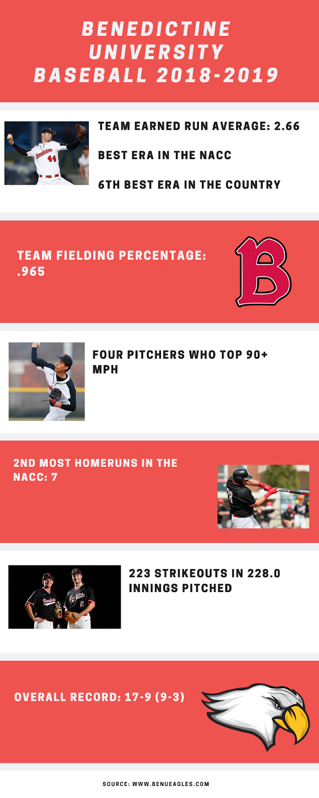
In an infographic, spacing is very important in order to maintain consistency and fluidity. A viewer will notice when pictures and text are unevenly spaced, and it creates an eyesore that defeats the purpose of the infographic. In my final project, I tried my best to create even spacing and text to avoid creating a distraction to the audience. Specifically, in my infographic I aim to appeal to potential recruits by showing off our stats and top performers. Avoiding potential eyesores is key in trying to get my message across to recruits. In my rough draft blog below, I had some uneven spacing and pictures that didn't properly show Benedictine Baseball.
After getting the feedback of family and friends, I decided to put in more pictures directly related to BenU Baseball as well as fix spacing issues and updated stats. The final draft our my blog avoids eyesores while showing off recruits what BenU Baseball is all about.